she shreds magazine
magazine design
Print Design | Photography
OVERVIEW, GOALS, & CHALLENGES
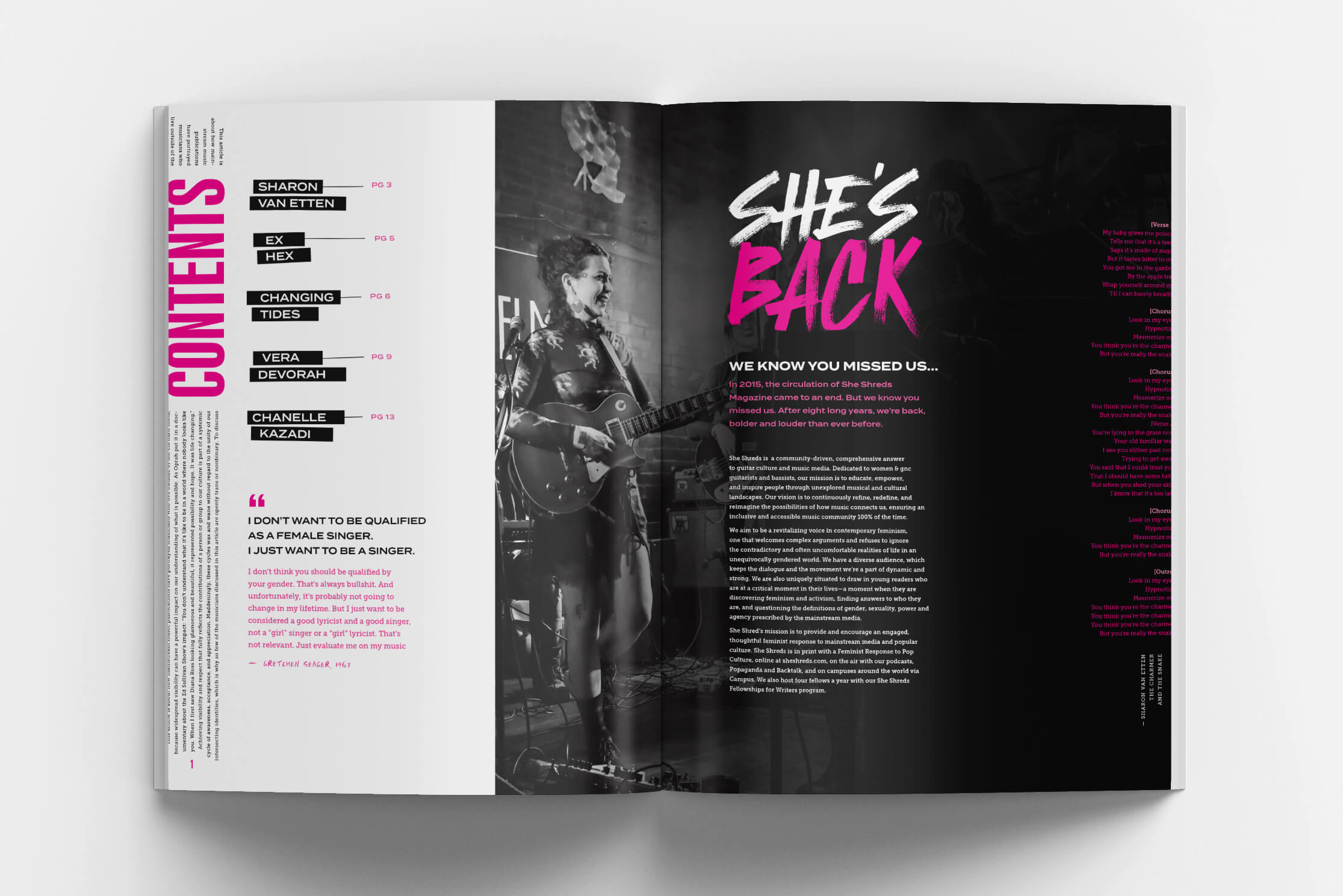
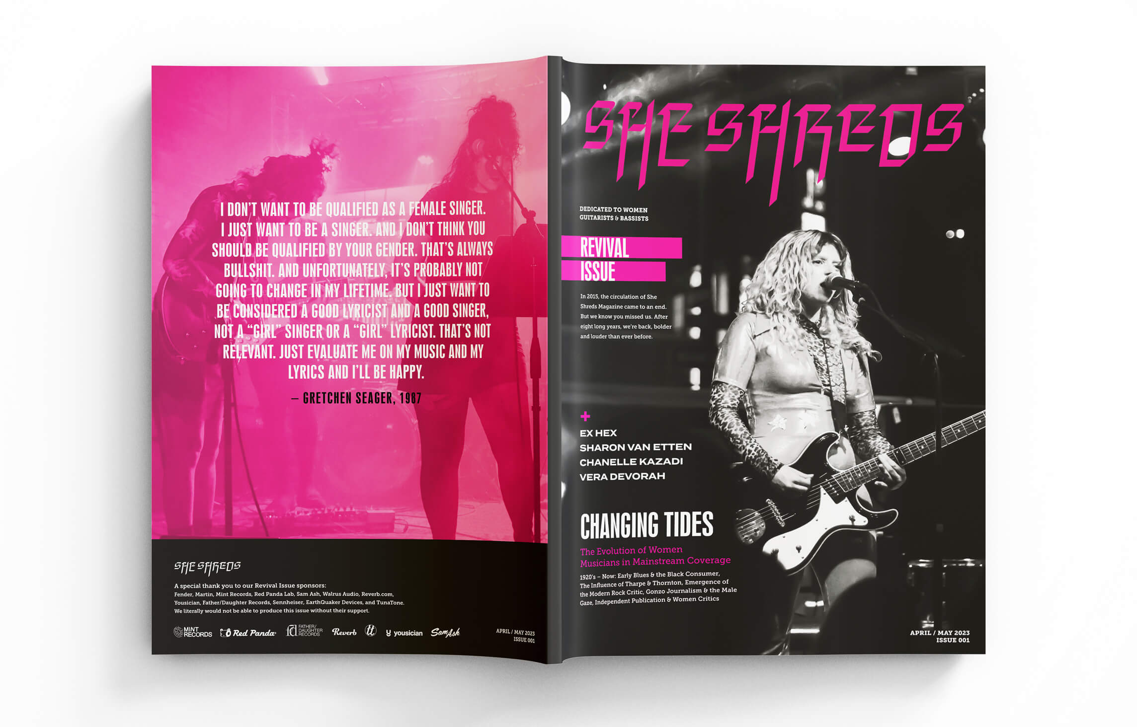
She Shreds is a magazine dedicated to women musicians with an emphasis on guitarists and bassists. Their mission is to educate, inspire and empower women through music and culture. Once in printed circulation, years ago She Shreds decided to move exclusively to online platforms.
Their long time fans have missed the excitement of receiving their subscriptions in the mail, flipping through each page and taking in their boldly designed spreads and photography. I wanted to create something that would serve as an inspiration for young artists, something that could be held onto and looked back on time and time again. With this goal in mind, She Shreds decided to bring their magazine back to life and this is their first printed edition in many years, the Revival Issue.
PHOTOGRAPHY & CREATIVE PROCESS
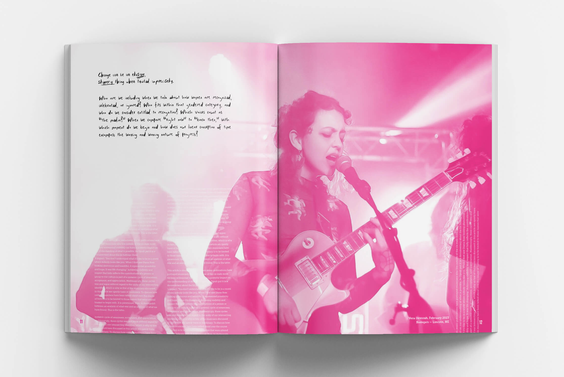
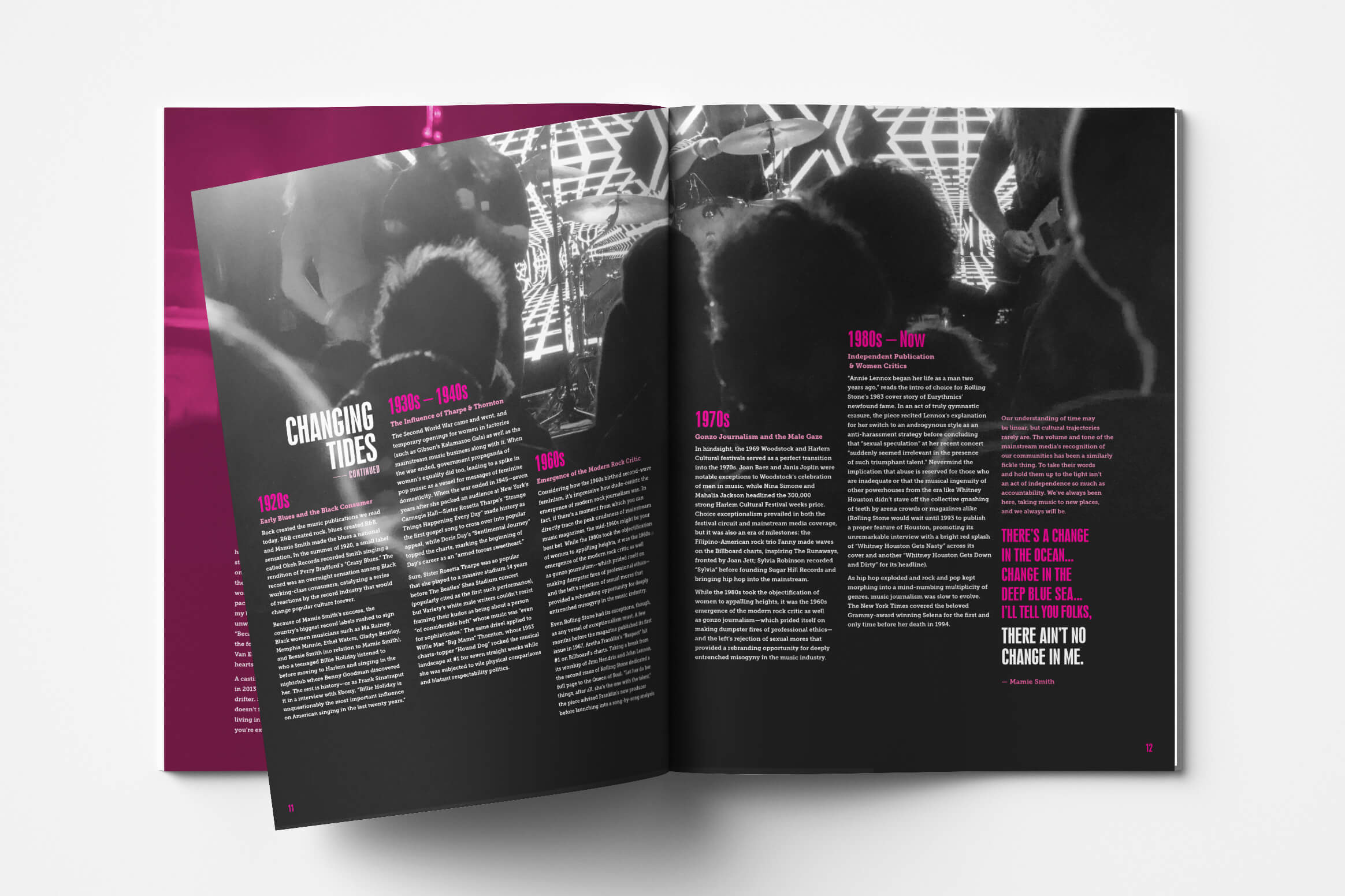
For this magazine, I wanted to highlight everything I love about design — detailed typography, thoughtful layouts, and photography. I chose to use a monochromatic color scheme to create an aesthetic that felt feminine and edgy. I was inspired by the creative women of Lincoln and spent many hours photographing local music events such as Lincoln Calling and Lincoln Exposed. Each spread was created to have unique designs and typography to fit the different featured artists. The combination of these elements helped fulfill the vision for the magazine and continue inspiring women for years to come.